Risk & Control
Building a Risk Register From Evidence, Not Assumptions
A field-tested approach to turning years of scattered audit findings, incident reports, and operational records into a defensible, evidence-based risk program.
Mohamed Magzoub Mahmoud · 6 min read
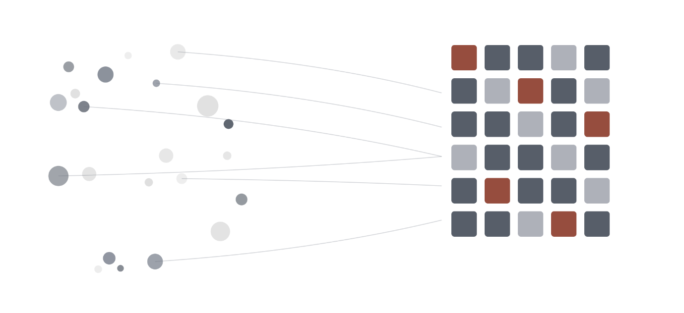
Most risk registers are written the same way: a room full of experienced people, a whiteboard, and a list of things that feel dangerous. It’s not a bad starting point, and the people in that room are usually right about a lot. But it has a quiet flaw. A risk register built this way reflects who was in the room, what they remember most vividly, and which conversations happened most recently — not necessarily what the organization’s own data has been trying to say for years.
On a recent risk and control initiative, I set out to test a different approach: instead of starting with a list of risks and looking for evidence to support them, start with the evidence itself — years of audit findings, incident reports, quality checklists, and project issue logs — and let the risk register emerge from what the data actually showed. The exercise surfaced a handful of lessons I think are worth sharing with anyone building or refreshing a risk programme, independent of industry or company size.
Raw volume lies. Normalize before you trust it.
The first instinct when you pool years of evidence together is to rank things by count: whichever business unit or theme has the most records must be the biggest problem. It’s almost never that simple. Larger, older, or more heavily audited parts of an organization will always generate more paperwork than smaller or newer ones, regardless of how risky they actually are.
The fix is straightforward but easy to skip under time pressure: normalize every figure against its own base before comparing it to anything else. Instead of asking “which unit has the most fire-safety findings,” ask “what share of this unit’s own evidence is fire-safety related, compared to the organization-wide average for that same category.” That single reframing regularly surfaced a completely different, much more useful picture — smaller business units with a disproportionate concentration in one theme, which raw counts had been quietly burying under the noise of larger units.
Map where your evidence comes from, not just what it says.
It’s tempting to treat a pool of combined evidence as one undifferentiated thing. It isn’t. Every record in a register like this has a source — a specific audit programme, an inspection checklist, an incident report, a self-assessment — and each of those sources has its own blind spots, built in by design, not by accident.
The most useful single exercise in this whole project was cross-tabulating evidence source against finding category. It revealed that one particular assurance function’s audits were almost entirely concentrated in a single operational theme, with several other significant risk categories receiving effectively zero coverage from that function — not because those risks didn’t exist, but because that audit programme was never scoped to look for them. Once mapped, this wasn’t a criticism of anyone’s performance; it was simply a visible gap in coverage design, and gaps you can see are gaps you can close. The uncomfortable alternative is a monitoring programme with an invisible single point of failure, discovered only after something goes wrong.
What doesn’t get reported is a signal in itself.
Most safety and operational literature expects a healthy reporting culture to surface far more near-misses and close calls than confirmed incidents — the logic being that most close calls get caught before they escalate, and a mature organization hears about them anyway. When we calculated this ratio across the full evidence base, it ran in the opposite direction: confirmed loss events slightly outnumbered documented near-misses.
That’s not necessarily a statement about how safe or unsafe the operations were. It’s a statement about the reporting culture and the tools available to capture early warning signals. A register that only grows when something has already gone wrong is, by definition, always one step behind. Making this ratio visible — rather than burying it inside a severity chart — turned out to be one of the most persuasive single numbers in the entire exercise, because it reframed the conversation from “how bad is it” to “how early do we find out.”
Evidence-based risks are the most provable ones — not necessarily the most complete list.
There’s a natural temptation, once you’ve built a defensible, data-backed set of proposed risks, to treat that list as exhaustive. It isn’t, and saying so explicitly turned out to matter. Because the risks that emerge from this kind of exercise are downstream of whatever your monitoring tools were built to see, business units or themes that fall outside your primary audit programme’s scope will always be under-represented in the output, no matter how real their underlying risk actually is.
The honest way to handle this is to say so in the same breath as presenting the findings: these are the risks the evidence can currently prove, not necessarily the complete universe of risk. That distinction protects the credibility of the exercise, and it quietly makes the case for expanding monitoring coverage into the areas the data admits it can’t yet see — which is a far more constructive conversation than pretending the list is complete.
Why this is worth the effort
None of this replaces professional judgment — experienced risk practitioners still need to interpret what the data is showing, challenge it, and fill the gaps it can’t reach on its own. But grounding a risk register in classified, source-mapped evidence changes the nature of the conversation with leadership. Instead of debating whether a risk feels significant, the conversation becomes about how much evidence already supports it, where that evidence came from, and what portion of the organization it may not yet be reaching.
That shift — from opinion to evidence, and from an assumed-complete list to an honestly-scoped one — is, in my experience, what makes a risk register something people actually trust and act on, rather than a document that gets updated once a year and quietly ignored in between.